Blogging is not something new to me with my experience of web design since i was 14, when Dreamweaver and Flash was still owned by Macromedia. But i never did realise that there was so much to web design or rather, i never took so much into consideration. My only concern was if it looked good and felt awesome to the eyes.
This practical assesment has definitely achieved a different approach of teaching as well as learning style for me and i would recommend to continue this approach.
Process:
It was an easy task to start off the blog as i own/have owned many blogs/websites in the past. It took me merely 15minutes before i started off my blogging journey.
The process of blogging was not the time consuming one, but the research of materials and reference to them were most tedious tasks.
I have learnt, believe it or not, to manage my time in designing, research, citations and penning my thoughts down. I did so by splitting the assignment up into parts and progressively doing one post at a time over a series of a few days. I wanted to post more but i could only handle so much, considering that this is the busy season at work without any lull period.
Well, i tried.
Theoretical development:
This is definitely a first academic blog for me and the experience is a little weird. however, it has taught me the fundamentals of web and print design as well as much more through my research from the nitty-gritty details of serif and sans serif fonts to the imagery and reading patterns. There is too much for me to list down here what i have learnt.
Like as the saying goes, Learning is a lifelong experience. I will continue to further study and explore the fundamentals of webdesign.
Standpoint:
Just like any other social networking media, blogging is one of the many other online networking tool for new media. People from all over the world can access the information you post/share online.
It brings me much joy to understand this, but at the same time it makes me frown as i have to be very careful with my words. Especially when i am living in Singapore, where freedom of speech is not so free due to the media censorship. Vetting my own work is one precautionary measure i take before clicking the "publish" button.
Sunday, February 20, 2011
Saturday, February 19, 2011
Online publication: Monoface

Source: < http://www.mono-1.com/monoface/main.html >
Labelled 2nd top Flash website of 2010, Monoface is a site highly recommended to tickle your funnybones. Do click on the link above to have a laugh from a tough day's work.
Design Principles
Alignment:
There is no clear alignment here. Only a sidebar and an animated image in the centre.
Proximity:
There is no proximity as there is hardly any content to be close to each other.
Repetition:
There are only a few other pages with the same navigation bar on the left and the home button on the bottom right.
Contrast:
The contrast is outstanding with basically 3 colours - A white background, blue texts and black texts.
Design of Webpage
Visual weight:
The main visual weight here is only the image in the middle of the screen. No major text is present.
White space:
There is abundant whitespace for concentration on the main imagery of the page. This gives a very srtistic feel to the site.
Webtype:
The typeface used here is Arial font which is a sans serifs font. This is good for short texts and not recommended for long texts.
Navigation:
It is easy to navigate through the pages as the links are all in the left navigation column and i can return back to the home page when i go to another page by clicking 'back'. Page to page navigation is slower as it is a flash-based website and animation is present for graphic aesthetics.
Scannability:
For a website with such simple content, i would say, yes, it is very scannable as users can, in one glance, capture the main gist of everything.
Readability:
High readability
Thursday, February 17, 2011
Online publication: Mcafee
 Source: < http://home.mcafee.com/Store/Store7.aspx? >
Design Principles
Alignment:
There is a clear horizontal 5 row alignment displayed - Header (Consisting of the Logo and search bar and Navigation bar), Heading, sub-heading, 1st row of products, 2nd row of products.
Proximity:
The proximity of the content is close to each other in groups.
Repetition:
The header is consistently the same on every page.
Contrast:
The contrast is good with white background and black font colour.
Design of Webpage
Weblog Usability:
This site is an official site for Mcafee products, majorly focusing on internet protection for domestic and business use.
Visual weight:
The page is set in clusters where there is 1 set of text to 1 image. This is to balance the visual weightage on the page.
White space:
The whitespace here is minimal but sufficient to allow comfortable readability.
Webtype:
the typeface used here is Arial font which is a sans serifs font. This is good for short texts and not recommended for long texts.
Navigation:
It is easy to navigate through the pages as the links are all in the header and i can return back to the home page at anytime by clicking on the logo at the header.
Scannability:
The headings and subheadings are clear and concise. High scannability with short texts and keywords in place.
Readability:
Closely linked to scannability. Due to the constituting factors as mentioned above, the page has a high readability.
Monday, February 14, 2011
Design Issues: New Design for Facebook
Source: Brown J 2011, Facebook Changes Page Design, video, YouTube, 10 Febuary, viewed 13 Febuary 2011, < http://www.youtube.com/watch?v=ZWAXr1c8GGg >
Saturday, February 12, 2011
Print publication: The Straits Time - Langkawi dolphin pens 'appalling'
 Source: < http://www.acres.org.sg/news/archives/14%20January%202011,%20Langkawi%20dolphin%20pens%20appalling,%20The%20Straits%20Times.jpg >
Design Principles
Balance:
The page is very well balanced with a dophin banner background and 2 illustrations of the same size rightin the centre. The text is equally divided into 5 columns below the image.
The page is very well balanced with a dophin banner background and 2 illustrations of the same size rightin the centre. The text is equally divided into 5 columns below the image.
Proportion:
The picture of the dolphins form the largest constituition, followed by the headlines and the 2 other images.
The picture of the dolphins form the largest constituition, followed by the headlines and the 2 other images.
Sequence:
The arrangement of the elements make readers start with the headlines followed by the pictures then the text.
Consistency:
All of The Straits Times publications have the same style in columnised and serif fonts in consistent paragraphing.
The arrangement of the elements make readers start with the headlines followed by the pictures then the text.
Consistency:
All of The Straits Times publications have the same style in columnised and serif fonts in consistent paragraphing.
Graphic Aids
Photograph:
the main photograph is the picture of 5 dophins as the background and 2 other smaller pictures of the conditions of the dophins' living conditions.
the main photograph is the picture of 5 dophins as the background and 2 other smaller pictures of the conditions of the dophins' living conditions.
Format Elements
Headings:
The headlines which are large, bold and catchy are set at the top of the page to catch readers' attention.
The headlines which are large, bold and catchy are set at the top of the page to catch readers' attention.
Colour:
The colour used here are subtle as it is a newspaper print. The photographs are not too contrasted to produce a soft touch.
The colour used here are subtle as it is a newspaper print. The photographs are not too contrasted to produce a soft touch.
The typeface used is in serif font, like in almost all newspaper prints for readability and scannability.
Whitespace:
The whitespace is minimal like in almost all newspaper articles to maximise the space in print.
Saturday, February 5, 2011
Print Publication: The Economist - The Oiloholics

Design Principles
Balance:
The image is designed to be symmetrical with a dragon, representing China, on the right and Uncle sam, representing the US on the left.
The image is designed to be symmetrical with a dragon, representing China, on the right and Uncle sam, representing the US on the left.
The oil barrels are also drawn as symmetrically as possible to highly the equality of both parties without prejudice
Proportion:
The image is the proportionately the largest followed by the Headlines, then the smaller headlines
The image is the proportionately the largest followed by the Headlines, then the smaller headlines
Sequence:
Uncle Sam and the dragon will prominently be the main focus as they appear in the middle, with bright colours contrasting the white background. Following that will be the headlines which are large, bold and catchy.
Consistency:
All of The Economist issues has the same header at the top of the page, with its trademark logo spelling 'The Economist' in white over a red background.
Graphic Aids
Drawing illustration: Uncle Sam and the dragon are illustrated in a comic art with fresh and bright, striking colours. The dark coloured barrels in the foreground, overlapping a little of the white background, make a nice contrast of the image, making readers draw their eyes to the centre.
Format Elements
Headings:
The headlines which are large, bold and catchy are set in the middle of the page.
The headlines which are large, bold and catchy are set in the middle of the page.
Colour:
The elements of colour here are fundamentally contrasting to each other(foreground and background), making them comfortable to the eye.
The elements of colour here are fundamentally contrasting to each other(foreground and background), making them comfortable to the eye.
Typographic Devices:
The typeface used is in sans serif font in huge and bold. This clearly illustrates the importance of the text.
Whitespace:
The top half of the page is made up of whitespace to ease the eyes of the color and also to stand out from the headline. This allow increases readability and in turn contributes to the typography of the page.
Tuesday, February 1, 2011
Publication Issues: Is there more than meets the eye?
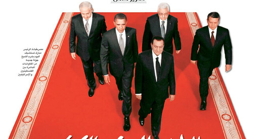 Manipulated
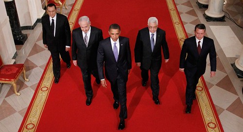 Original
Is seeing, believing? Or is a time to speculate if there is editing? This is the question.
The illustration shows Mubarak in the front, and the original one shows he was actually walking behind Israeli Prime Minister, Benjamin Netanyahu, Palestinian President Mahmoud Abbas and Jordanian King Abdullah II, as American president Barack Obama led the men to the Middle East peace talk at the White House.
Graphic Manipulation is something very real in the present era with photo editing programs and skills progressing to higher levels take are not obvious to the untrained eyes.
However, i am against this as it shows the unprofessionalism and unethical. In the journalistic world, nothing like this should happen even though it helps to bring the viewership.
Source: B 2010, 'Digital Manipulation Blunder and Defiance', Treasure of Baghdad, blog posting, 19 September, viewed 1 February 2011, < http://www.bassamsebti.com/2010/09/digital-manipulation-blunder-and.html >.
Subscribe to:
Comments (Atom)